
Data analysis is the process of cleaning, transforming, and modeling data to extract meaningful insights and inform decision-making. In today's world, data analysis has become a critical skill for businesses, researchers, and policymakers alike.
Data analysis helps organizations identify trends, patterns, and relationships in their data and use these insights to drive business decisions, optimize processes, and gain a competitive advantage.
Python has made it possible for analysts and data scientists to quickly and efficiently perform a wide range of data-related tasks, from data cleaning and preparation to statistical analysis and machine learning.
Note : If you face issues wirth images please run :plt.close('all') in your code then remove it and re-execute
Pandas is a Python library used for data manipulation and analysis. It provides data structures and functions needed to work on structured data seamlessly. Pandas is built on top of the NumPy library and is used for tasks such as data cleaning, data transformation, data analysis, and data visualization.
To work with data using Pandas, you first need to load it into a Pandas DataFrame. Here's an example of how to load a CSV file into a DataFrame:
import pandas as pd
# Read data from a CSV file
dataFromCSV = pd.read_csv('data.csv')
# Alternatively, you can directly download a dataset from a URL:
df = pd.read_csv('https://archive.ics.uci.edu/ml/machine-learning-databases/car/car.data')
# Read data from an Excel file
dataFromExcel = pd.read_excel('data.xlsx')
# Read data from a JSON file
dataFromJSON = pd.read_json('data.json')
names = ['buying','maint','doors','persons','lug_boot','safety','class']
df = pd.read_csv(url, names=names)
# Display the first 5 rows
print(df.head())
# Display the last 5 rows
print(df.tail())
# Display columns
print(df.columns)
# Display information about the DataFrame
print(df.info())
Before starting any data analysis, it's important to clean and prepare the data. Here are some common data cleaning and preparation tasks you can perform using Pandas:
Here's some examples :
# remove rows with missing values
df = df.dropna()
# remove duplicate rows
df = df.drop_duplicates()
# rename columns
df = df.rename(columns = {'old_col_name_1': 'new_col_name_1', 'old_col_name_2': 'new_col_name_2'})
# change data type of a column
df['some_col_name'] = df['some_col_name'].astype(float)
# deal with outliers by removing any rows that fall outside of a certain range
q1 = df['some_col_name'].quantile(0.25)
q3 = df['some_col_name'].quantile(0.75)
iqr = q3 - q1
lower_bound = q1 - (1.5 * iqr)
upper_bound = q3 + (1.5 * iqr)
df = df[(df['some_col_name'] > lower_bound) & (df['some_col_name'] < upper_bound)]
Once the data is loaded and cleaned, you can start analyzing it. Here's some examples of how to select from a DataFrame:
Selecting Columns
# Select a single column
col1 = df['buying']
# Select multiple columns
cols = df[['buying', 'maint']]
Selecting Rows
# Select rows based on a condition
subset = df[ df['safety'] == 'high']
# Select rows based on multiple conditions
subset = df[(df['buying'] == 'high') & (df['doors'] == '2' )]
Locating Data
# Select rows and columns using the loc method
subset = df.loc[(df['lug_boot'] == 'big'), ['buying', 'maint'] ]
# Select rows and columns using the iloc method
subset = df.iloc[1:5, 0:2]
Modifying Data
# Set a value in a specific cell
df.loc[0, 'buying'] = 'low'
# Set values in a specific column based on a condition
df.loc[(df['buying'] == 'vhigh'), 'maint' ] = 'low'
Creating New Columns
# Create a new column based on existing columns
df['new_col'] = (df['buying'] + "_" + df['maint'] )
You can also perform data aggregation and grouping using Pandas. Here's an example of how to group data by a specific column and compute the mean of another column:
Let's group the data by the 'buying' column and compute the mean of the 'safety' column:
# Load the car evaluation dataset
import pandas as pd

# Define column names and load data
url = 'https://archive.ics.uci.edu/ml/machine-learning-databases/car/car.data'
names = ['buying','maint','doors','persons','lug_boot','safety','class']
df = pd.read_csv(url, names=names)

# Define a mapping dictionary
mapping = {'low': 1, 'med': 2, 'high': 3}

# Map the values to numbers using the mapping dictionary
df['buying'] = df['buying'].map(mapping)
df['safety'] = df['safety'].map(mapping)

# Group the data by the 'buying' column and compute the mean of the 'safety' column
grouped = df.groupby( ['buying'] )['safety'].mean()
print(grouped)
Numpy is a fundamental library for scientific computing in Python. It provides powerful tools for working with arrays, and is widely used in data analysis, machine learning, and other fields. With Numpy, you can perform mathematical operations on arrays, manipulate and reshape data, and perform a variety of data analysis tasks.
This is a strightforward task, below you'll find most common and basic array usage in Numpy
import numpy  as np

# Basic Numpy arrays
arr = np.array([1, 2, 3])
print(arr)
Creating arrays
# Create an array filled with zeros
arr_zeros = np.zeros((3, 3))
printarr_zeros{arr_zeros}
# Create an array filled with ones
arr_ones = np.ones((2, 4))
print({arr_ones})
# Create an array filled with ones
arr_random = np.random.rand(2, 2)
print({arr_random})
# Create an array of random numbers between 0 and 1
arr_range = np.arange(10)
print({arr_range})
# Create an array with a specified range of values
arr_linspace = np.linspace(0, 10, 5)
print({arr_linspace})
# Create an array of evenly spaced values over a specified interval
arr_evenly_spaced = np.arange(0, 10, 2)
print({arr_evenly_spaced})
Indexing and Slicing
arr = np.array([[1, 2, 3], [4, 5, 6], [7, 8, 9]])
# Accessing multiple elements using slicing
arr_slice = arr[:2, :-1]
print(arr_slice)# Output: Selecting the first two rows and all columns except the last one
# Accessing the entire second row
row_2 = arr[1]
print(row_2)# Output: The second row of the array
# Accessing multiple elements using slicing
arr_sub = arr[:2, :2]
print(arr_sub)# Output: Selecting the first two rows and the first two columns
# Accessing the first two rows and the last two columns
subset = arr[:2, -2:]
print(subset)# Output: The first two rows and the last two columns of the array
Array Arithmetic and Broadcasting
# Broadcasting: is a mechanism in NumPy that allows arrays with different shapes to be combined in arithmetic operations. When performing operations between arrays of different shapes, NumPy automatically "broadcasts" the arrays to make their shapes compatible.
arr1 = np.array([1, 2, 3])
arr2 = np.array([4, 5, 6])
# Addition of two arrays
print(arr1 + arr2)
# Output: Element-wise addition of arr1 and arr2
# Multiplication of two arrays
print(arr1 * arr2)
# Output: Element-wise multiplication of arr1 and arr2
In Numpy, arrays can have different data types, such as integers, floats, and booleans. These data types are important because they affect how the data is stored and processed by the computer.
The most commonly used data types in Numpy include: int8, int16, int32, int64, float16, float32, float64, bool, and complex128. You can specify the data type of a Numpy array when you create it or change the data type of an existing array using the astype() method.
To create a Numpy array with a specific data type, you can use the dtype parameter in the array() function. For example, to create an array of integers with 32-bit precision, you would use the following code:
import numpy as np;
arr = np.array([1, 2, 3], dtype=np.int32);
You can also change the data type of an existing array using the astype() method. For example, to change the data type of an array of integers to 64-bit floats, you would use the following code:
import numpy as np;
arr = np.array([1, 2, 3]);
arr = arr.astype(np.float64);
Numpy provides a wide range of functions for manipulating and analyzing arrays. Here are some of the most commonly used functions:
This function is used to change the shape of an array without changing its data. For example, if you have an array with 12 elements, you can reshape it into a 3x4 matrix using the reshape function.
import numpy as np;

# create a 1D array of 10 elements
a = np.arange(10);
# reshape the array into a 2D array with 5 rows and 2 columns
b = np.reshape(a, (5, 2));

# print both arrays to see the difference
print("Original array:\n", a);
print("Reshaped array:\n", b);
This function is used to reverse or permute the axes of an array. For example, if you have a 2D array with shape (3, 4), you can transpose it to get an array with shape (4, 3).
import numpy as np;

# create a 2D array
arr = np.array([[1, 2], [3, 4]]);

# print the original array
print("Original array:");
print( arr"Transposed array:"
print(transposed_arr);
This function is used to find the sum of all elements in an array. You can also specify the axis along which to compute the sum.
import numpy as np;

arr = np.array([[1, 2], [3, 4]]);

# Calculate the sum of all elements in the array
total_sum = np.sum(arr);

# Calculate the sum of each row
row_sums = np.sum(arr, axis=1);

# Calculate the sum of each column
col_sums = np.sum(arr, axis=0);

print("Total sum:", total_sum);
print("Row sums:", row_sums);
print("Column sums:", col_sums);
This function is used to find the mean (average) of all elements in an array. You can also specify the axis along which to compute the mean.
import numpy as np;

# Create a 2D array with random values
arr = np.random.rand(3, 4);

# Calculate the mean of the entire array
mean = np.mean(arr);

# Calculate the mean along the rows (axis 1)
row_means = np.mean(arr, axis=1);

# Calculate the mean along the columns (axis 0)
col_means = np.mean(arr, axis=0);

print("Array:", arr);
print("Mean of the entire array:", mean);
print("Row means:", row_means);
print("Column means:", col_means);
This function is used to find the standard deviation of all elements in an array. You can also specify the axis along which to compute the standard deviation.
import numpy as np
data = np.array([1, 2, 3, 4, 5])
std = np.std(data)
print("Standard deviation:", std)
Numpy arrays can be multi-dimensional and can also be structured or record arrays. Here's an overview of these advanced array types:
You can also perform operations on multi-dimensional arrays, such as np.sum(), np.mean(), np.std(), and many more.
import numpy as np
my_array = np.array([[1, 2, 3], [4, 5, 6]])
# Print the array
print(my_array)

# Access individual elements in a multi-dimensional array using indexing
element = my_array[0, 1]
print(element)
# Sum of all elements in the array
total_sum = np.sum(my_array)
print("Total sum:", total_sum)
# Mean of all elements in the array
mean_value = np.mean(my_array)
print("Mean value:", mean_value)
# Standard deviation of all elements in the array
std_dev = np.std(my_array)
print("Standard deviation:", std_dev)
Structured arrays: Numpy allows you to define arrays with named fields, similar to a database table. This can be useful for representing structured data such as CSV or JSON files.
import numpy as np

# Define data types for each field
dtype = [('name', 'S10'), ('age', int)]

# Create structured array
data = np.array([('John', 25), ('Mary', 30), ('Tom', 40)], dtype=dtype)

# Access individual fields
print(data['name'])
print(data['age'])

# Access individual records
print(data[0])
print(data[1])
Record arrays: This is a subtype of structured arrays where each element is a record that contains multiple fields. Record arrays can be accessed using field names or indices.
# Accessing Fields of a Record Arrayimport numpy as np

# Define the data types of the record array
dt = np.dtype([('name', 'U10'), ('age', 'i4'), ('weight', 'f8')])

# Create a record array with three elements
data = np.array([('Alice', 25, 130.0), ('Bob', 30, 150.0), ('Charlie', 35, 180.0)], dtype=dt)

# Access the fields of the record array as object attributes
print( data['name'][0])        # Output: 'Alice'
print(data['age'][1])        # Output: 30
print (data['weight'][2])   # Output: 180.0
Matplotlib is a powerful library for creating visualizations in Python. It provides a wide range of options for customizing the appearance of your plots and charts. In this tutorial, we'll cover the basics of using Matplotlib for data visualization.
Matplotlib is a 2D plotting library that allows you to create a wide range of charts and plots. It was created by John Hunter in 2003 as a way to replicate the plotting capabilities of MATLAB in Python. Since then, it has become one of the most popular data visualization libraries in the Python ecosystem.
Let's start by creating a simple line chart using Matplotlib. Here's the code:
import matplotlib.pyplot as plt

x = [1, 2, 3, 4]
y = [10, 5, 20, 8]

plt.plot(x, y)
plt.show()
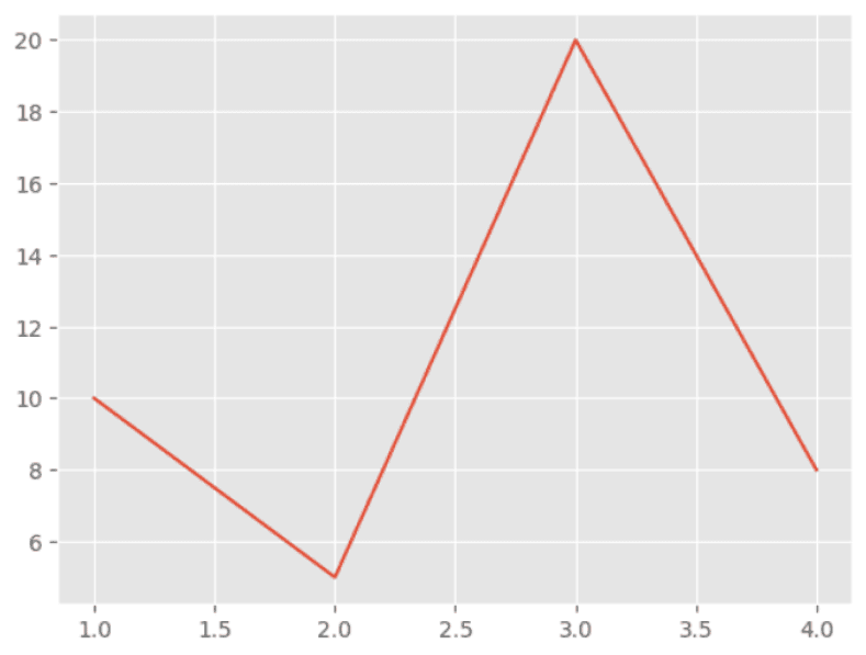
In this example, we're using the plot function to create a line chart. The first argument is the x-axis values, and the second argument is the y-axis values. When we call plt.show(), a window will appear with our chart displayed.
We can customize our chart by adding a title, axis labels, and changing the style of the line. Here's an example:
import matplotlib.pyplot as plt

x = [1, 2, 3, 4]
y = [10, 5, 20, 8]

plt.plot(x, y, color="red", linestyle="--")
plt.title("My Line Chart")
plt.xlabel("X-axis", color="#2AAA8A")
plt.ylabel("Y-axis", color="#2AAA8A")
plt.show()
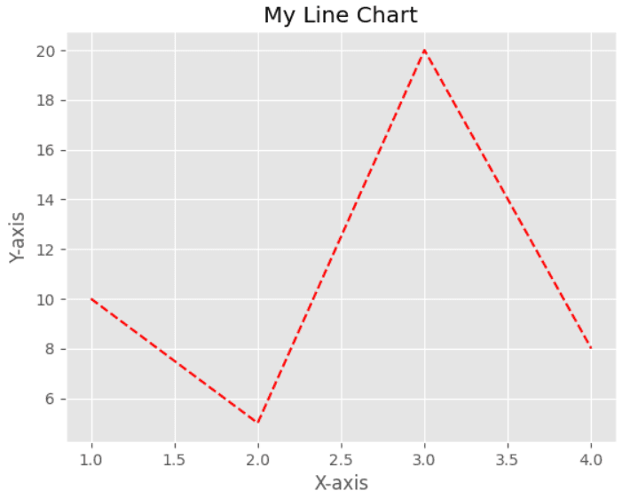
In this example, we've added a title to our chart with the title function, and axis labels with the xlabel and ylabel functions. We've also changed the color of the line to red using the color parameter, and set the size of the plot to 8 inches by 5 inches using the figure function.
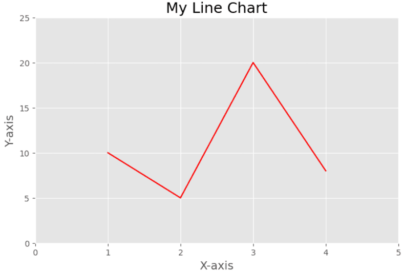
In this example, we've added a title to our chart with the title function, and axis labels with the xlabel and ylabel functions. We've also changed the font size of the title and axis labels using the fontsize parameter, and adjusted the axis limits using the xlim and ylimfunctions.
import matplotlib.pyplot as plt

x = [1, 2, 3, 4]
y = [10, 5, 20, 8]

plt.figure(figsize=(8, 5))
plt.plot(x, y, color="red")
plt.title("My Line Chart", fontsize=18, color="#2AAA8A" )
plt.xlabel("X-axis", fontsize=14, color="#2AAA8A" )
plt.ylabel("Y-axis", fontsize=14, color="#2AAA8A" )
plt.xlim(0, 5)
plt.ylim(0, 25)
plt.show()
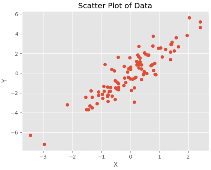
Scatter Plots: Scatter plots are used to display the relationship between two variables. Here's an example:
import matplotlib.pyplot as plt
import numpy as np

x = np.random.normal(0, 1, 100)
y = 2*x + np.random.normal(0, 1, 100)

plt.scatter(x, y)

plt.title("Scatter Plot of Data",color="#2AAA8A")
plt.xlabel("X",color="#2AAA8A")
plt.ylabel("Y",color="#2AAA8A")

plt.show()
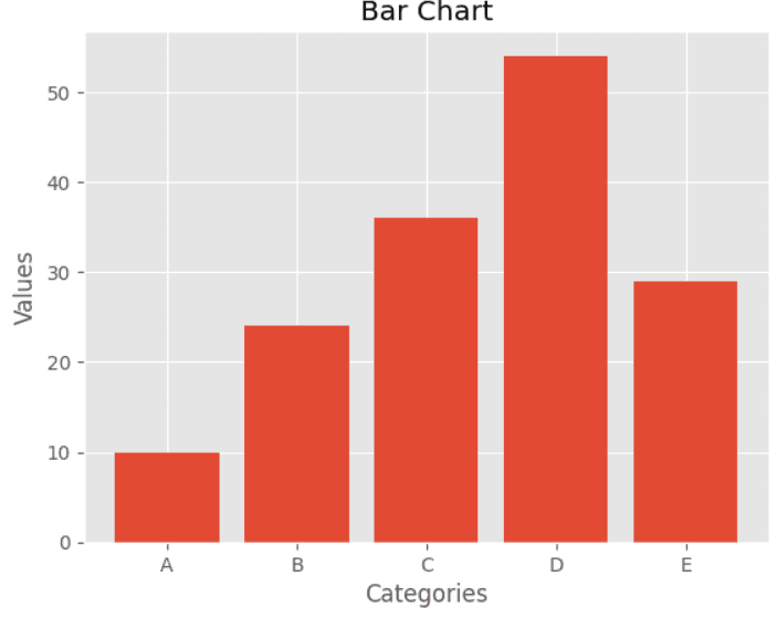
Bar Charts: Bar charts are used to compare values across different categories. Here's an example:
import matplotlib.pyplot as plt

# Data
labels = ['A', 'B', 'C', 'D', 'E']
values = [10, 24, 36, 54, 29]

# Create bar chart
plt.bar(labels, values)
plt.title('Bar Chart',color="#2AAA8A")
plt.xlabel('Categories',color="#2AAA8A")
plt.ylabel('Values',color="#2AAA8A")
plt.show()
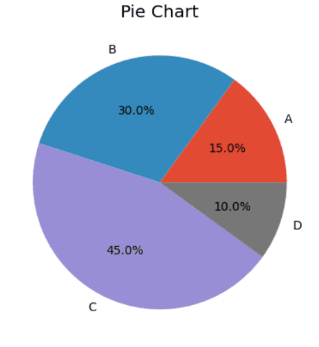
Pie Charts: Pie charts are used to show the proportion of different categories in a dataset. Here's an example:
import matplotlib.pyplot as plt

# Data
labels = ['A', 'B', 'C', 'D']
sizes = [15, 30, 45, 10]

# Create pie chart
plt.pie(sizes, labels=labels, autopct='%1.1f%%')
plt.title('Pie Chart',color="#2AAA8A")
plt.show()
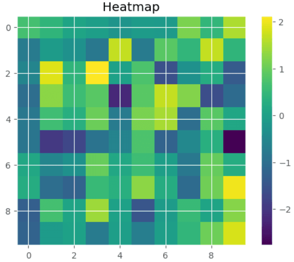
Heatmaps: Heatmaps are used to show the distribution of data across a 2D grid. Here's an example:
import matplotlib.pyplot as plt
import numpy as np

# Generate random data
data = np.random.randn(10, 10)

# Create heatmap
plt.imshow(data, cmap='viridis')
plt.colorbar()
plt.title('Heatmap',color="#2AAA8A")
plt.show()
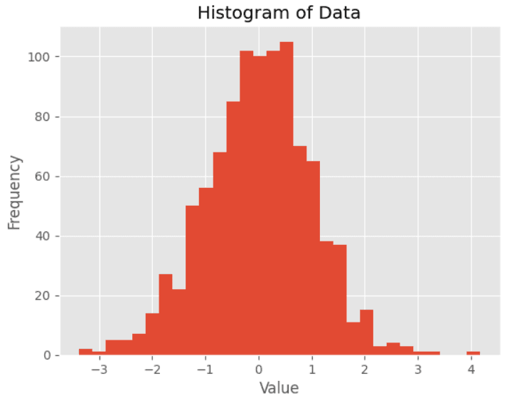
Histograms: Histograms are used to visualize the distribution of a dataset. You can create a histogram using the hist() function in Matplotlib. Here's an example:
import matplotlib.pyplot as plt
import numpy as np

# Create some data
data = np.random.normal(0, 1, 1000)

# Create a histogram of the data
plt.hist(data, bins=30)

# Add a title and axis labels
plt.title("Histogram of Data",color="#2AAA8A")
plt.xlabel("Value",color="#2AAA8A")
plt.ylabel("Frequency",color="#2AAA8A")

# Display the plot
plt.show()
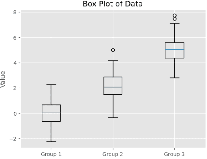
Box plots: Box plots are used to visualize the distribution of a dataset and identify outliers. You can create a box plot using the boxplot() function in Matplotlib. Here's an example:
import matplotlib.pyplot as plt
import numpy as np

# Create some data
data = [ np.random.normal(0, 1, 100), np.random.normal(2, 1, 100),
 np.random.normal(5, 1, 100) ]

# Create a box plot of the data
plt.boxplot(data)

# Add a title and axis labels
plt.title("Box Plot of Data",color="#2AAA8A")
plt.xticks( [1, 2, 3], ["Group 1", "Group 2", "Group 3"],color="#2AAA8A")
plt.ylabel("Value",color="#2AAA8A")

# Display the plot
plt.show()
Seaborn is a Python data visualization library based on Matplotlib. It provides a high-level interface for creating informative and attractive statistical graphics. In this section, we'll explore some of the basic visualization techniques that Seaborn has to offer.
Seaborn is built on top of Matplotlib and integrates closely with the data structures from Pandas. It provides several built-in themes and color palettes to make it easy to create aesthetically pleasing visualizations.
Seaborn provides several types of plots for visualizing statistical data. These include:
Histograms
A histogram is a graphical representation of the distribution of a numerical dataset. Here's an example using Seaborn's built-in "tips" dataset:
import seaborn as sns

# Load sample data
tips_data = sns.load_dataset('tips')

# Create a histogram
sns.histplot(data=tips_data, x='total_bill', bins=10 )


# Show the plot
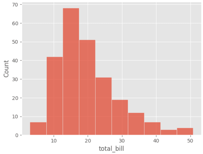
In this example, we've used the distplot function to plot the distribution of the "total_bill" column in the tips dataset. The kde parameter controls whether to show the kernel density estimate plot or not.
A density plot is a type of data visualization that shows the distribution of a set of continuous data by estimating the probability density function of the underlying variable. It is a smoothed version of a histogram, and is useful for identifying the shape of the distribution, detecting outliers, and comparing different distributions.
import matplotlib.pyplot as plt
import import seaborn as sns

# load sample data
tips_data = sns.load_dataset('tips')

# create a density plot
sns.kdeplot(data=tips_data, x='total_bill')
# display the plot
plt.show()
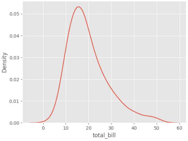
In this example, we've used the kdeplot function to plot the kernel density estimate of the "total_bill" column in the tips dataset.
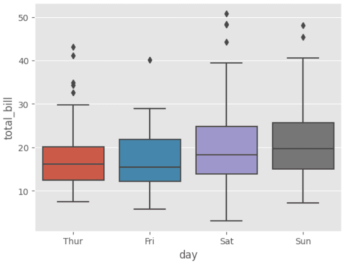
A box plot is a type of data visualization that displays the distribution of a set of continuous data through their quartiles. It is useful for identifying outliers, comparing distributions, and detecting skewness.
A violin plot is a type of data visualization that combines aspects of a box plot and a kernel density plot to show the distribution of a set of continuous data. It is useful for identifying the shape and spread of the distribution, comparing multiple distributions, and detecting outliers.
import seaborn as sns

# load sample data
tips_data = sns.load_dataset('tips')

# create a box plot
sns.boxplot(data=tips_data, x='day', y='total_bill')
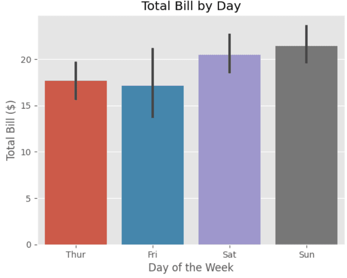
A bar plot is a type of data visualization that displays the values of a categorical variable as bars. It is useful for comparing the frequencies or values of different categories.
import seaborn as sns
import matplotlib.pyplot as plt

# Load example dataset
tips = sns.load_dataset("tips")

# Create bar plot
sns.barplot(x="day", y="total_bill", data=tips)

# Set plot title and axis labels
plt.title("Total Bill by Day")
plt.xlabel("Day of the Week")
plt.ylabel("Total Bill ($)")
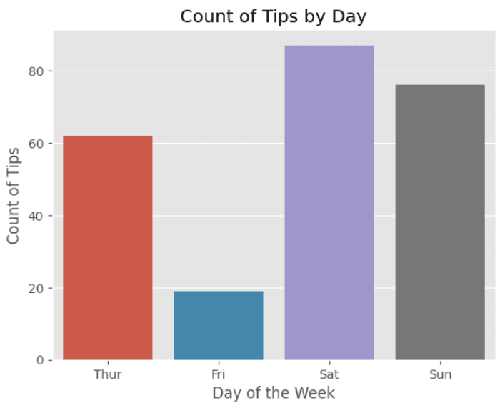
A count plot is a type of bar plot that shows the frequency of observations in each category of a categorical variable. It is similar to a histogram, but for categorical rather than continuous data.
import seaborn as sns
import matplotlib.pyplot as plt

# Load the dataset
tips = sns.load_dataset("tips")

# Create the count plot
sns.countplot(x="day", data=tips)

# Add a title and labels
plt.title("Count of Tips by Day")
plt.xlabel("Day of the Week")
plt.ylabel("Count of Tips")

# Display the plot
plt.show()
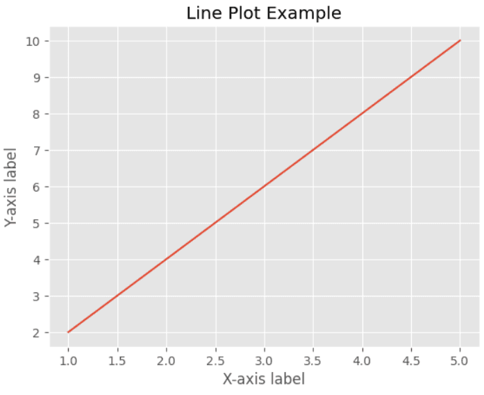
A type of data visualization that displays data as a series of data points connected by straight lines. It helps to identify trends, patterns, and relationships between variables over time. Seaborn provides the lineplot() function to plot line plots.
import seaborn as sns
import matplotlib.pyplot as plt

# create sample data
x = [1, 2, 3, 4, 5]
y = [2, 4, 6, 8, 10]

# create line plot
sns.lineplot(x=x, y=y)

# set plot title and labels
plt.title('Line Plot Example')
plt.xlabel('X-axis label')
plt.ylabel('Y-axis label')

# show plot
plt.show()
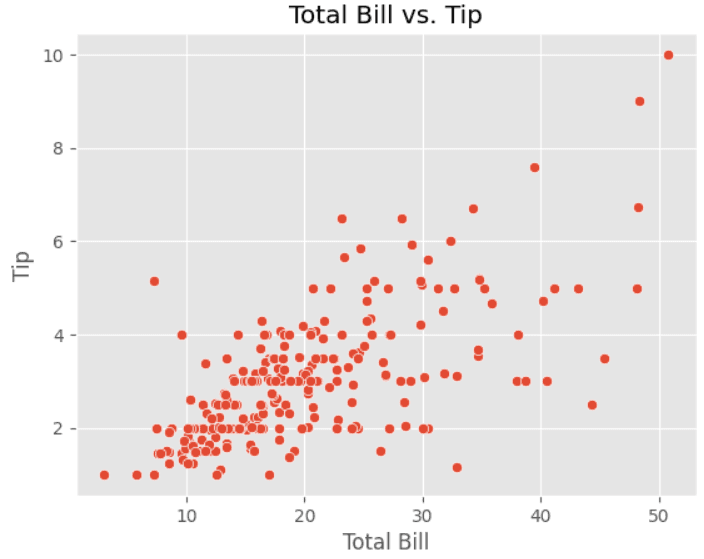
A graphical representation of the relationship between two variables in a dataset. It helps to identify patterns in the data, relationships between variables, and outliers. Seaborn provides the scatterplot() function to plot scatter plots.
import seaborn as sns
import matplotlib.pyplot as plt

# load data
tips = sns.load_dataset("tips")

# create scatter plot using seaborn
sns.scatterplot(data=tips, x="total_bill", y="tip")

# set plot title and axis labels
plt.title("Total Bill vs. Tip")
plt.xlabel("Total Bill")
plt.ylabel("Tip")

# display the plot
plt.show()
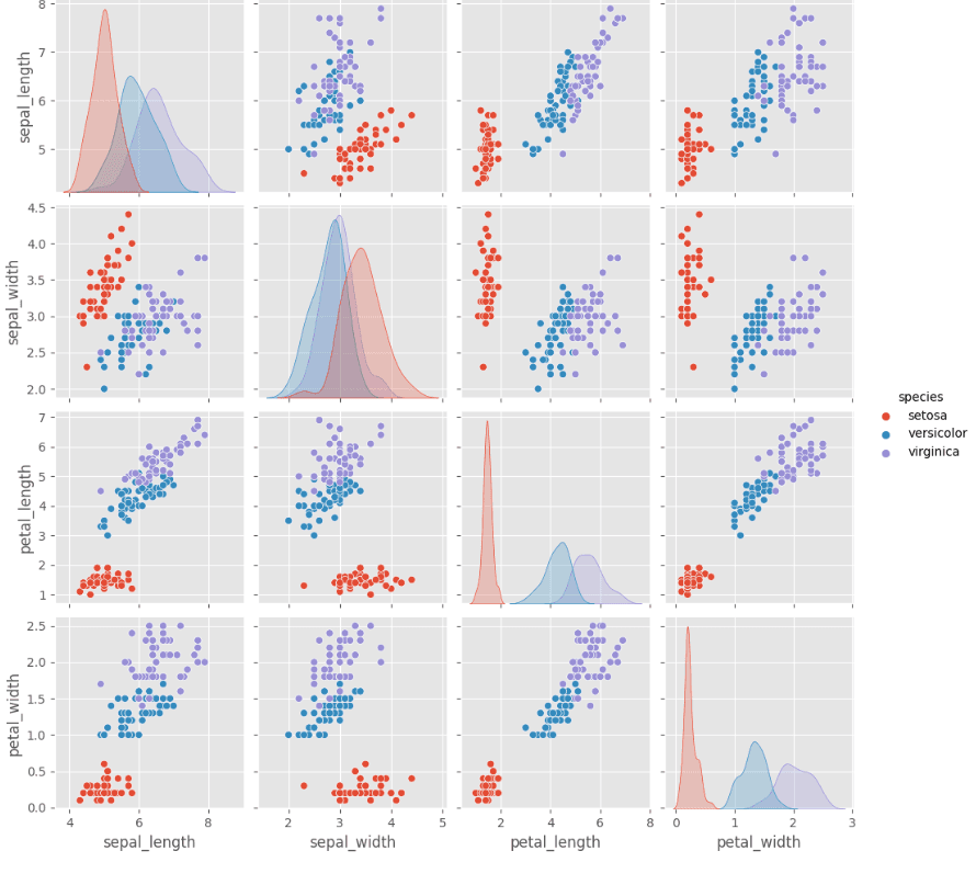
A type of data visualization that shows the pairwise relationships between variables in a dataset. It helps to identify patterns and relationships between variables in a dataset. Seaborn provides the pairplot() function to plot pair plots.
import seaborn as sns
import pandas

# Load dataset
iris = sns.load_dataset("iris")

# Create pair plot
sns.pairplot(iris, hue="species")
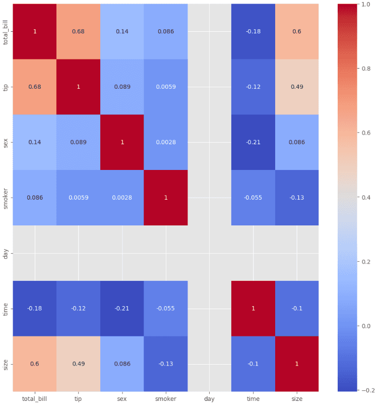
A type of data visualization that displays the correlation between variables in a dataset as a color-encoded matrix. It is useful for identifying patterns and relationships between variables in a dataset. Seaborn provides the heatmap() function to plot heatmaps.
import seaborn as sns
import pandas as pd

# Load sample data
df = sns.load_dataset('tips')
mapping = {'No':1,'Yes':2}
mapping1 = {'Female':1,'Male':2}
mapping2 = {'Sun':1,'Mon':2}
mapping3 = {'Dinner':1,'Lunch':2}

df['smoker']= df['smoker'].map(mapping)
df['day']= df['day'].map(mapping2)
df['time']= df['time'].map(mapping3)
df['sex']= df['sex'].map(mapping1)

sns.heatmap(df.corr(), annot=True, cmap='coolwarm')
In conclusion, data analysis with Python is a crucial skill in today's data-driven world. Python provides a wide range of powerful libraries and tools for data analysis, including NumPy, Pandas, Matplotlib, Scikit-learn, and more. These libraries allow us to manipulate, visualize, and model complex datasets, making it easier to extract insights and make data-driven decisions.
Whether you are a data scientist, business analyst, or just someone interested in data analysis, learning Python can help you become more efficient and effective in your work. With the increasing amount of data available, data analysis is becoming a necessary skill in many industries. Python provides an excellent platform for beginners and experts alike to explore, manipulate, and analyze data.
By learning the basics of data analysis in Python, you can gain a deeper understanding of your data, identify patterns and trends, and ultimately make better decisions based on data-driven insights. So, start learning today and unlock the power of data analysis with Python!